Test twenty pack directions in an afternoon.
Identity winning packaging designs
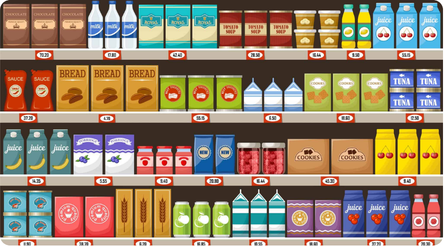
How a pack design is evaluated
| My design variations | Me vs. competition | Old vs. new | |
|---|---|---|---|
| Packaging | Design diagnosticsWhich of these directions communicates best on its own? | Design diagnosticsHow does my design read next to a rival's? | Design diagnosticsIs the new design clearer than the one it replaces? |
| Physical shelf | StandoutWhich design wins at shelf distance, among my own options? | StandoutDo I beat the category leader at arm's length? | Standout & recognitionDoes the redesign stand out more, without losing the brand? |
| Digital shelf | FindabilityWhich design survives shrinking to a search-grid thumbnail? | FindabilityDo I get lost next to competitors in the same grid? | Findability & recognitionDoes the redesign still read at 100px, and still look like us? |
The two questions teams miss most
A redesign has to win two different things
Redesign failures are almost always recognition failures. The new pack gets noticed just fine; shoppers just stop recognizing it fast enough to grab it out of habit. We score both sides: whether the new design wins on standout, and whether it keeps the same share of attention on the logo, color block, and other locked brand assets that the old design had. A win on one axis and a loss on the other isn't a win.
The same pack can win in-store and disappear online
A design that stands out at arm's length on a physical shelf often gets lost in an Amazon search grid, where it's a thumbnail under 100 pixels wide next to price, ratings, and sponsored listings. We test both: standout at shelf distance and angle, and legibility at true thumbnail size, against the Mobile Ready Hero Image standard retailers already use.








What a report returns
- 1Pack Attention Index
- 2Cognitive metrics
- 3Attention maps for packaging
- 4Element-level detail
- 5Recommendations